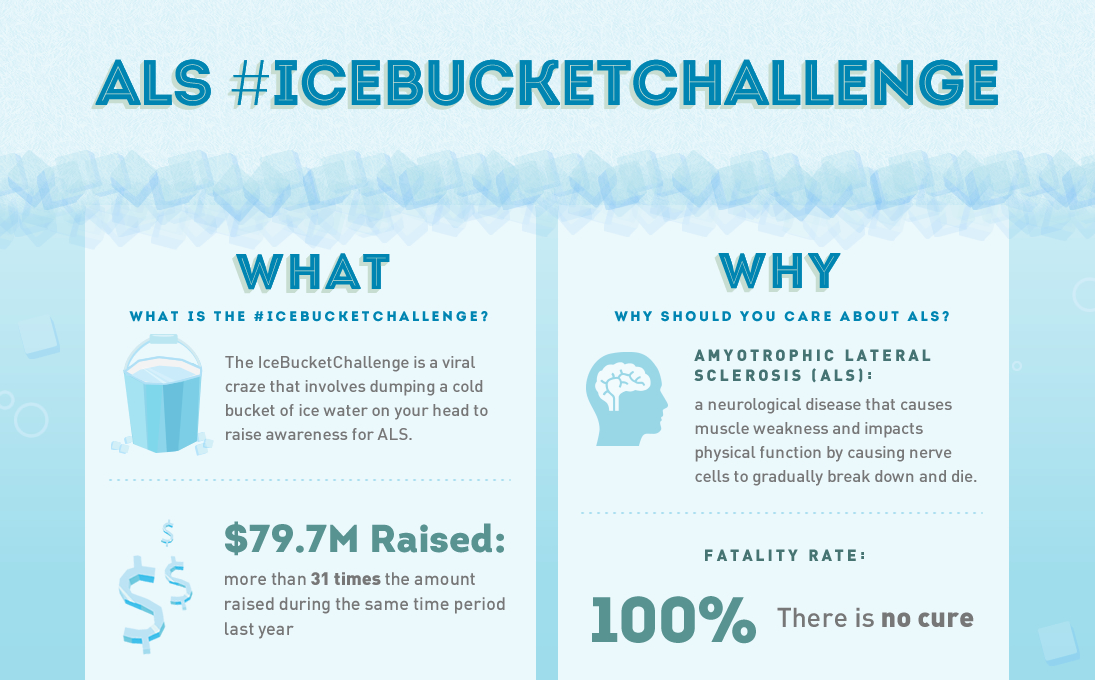
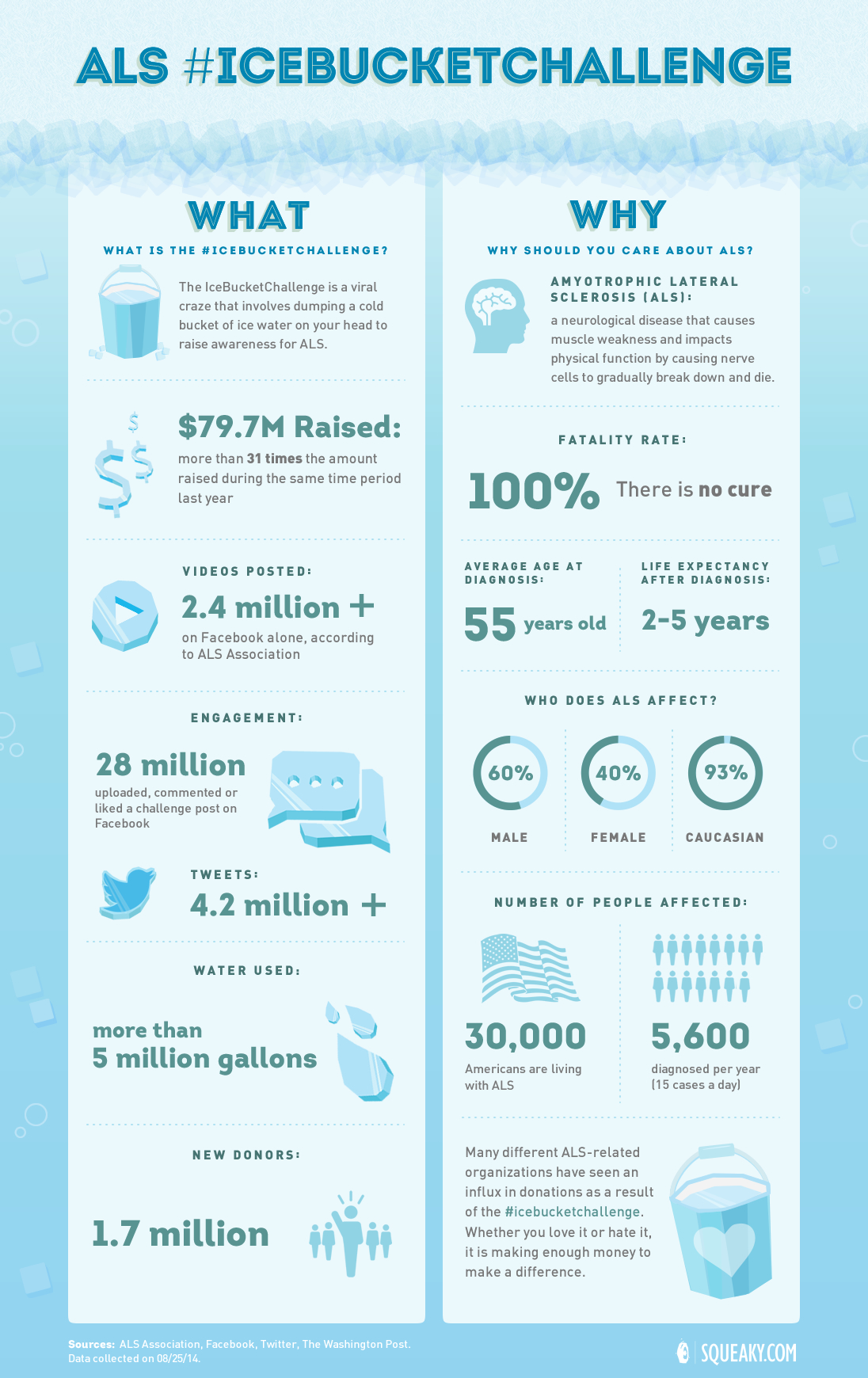
Featured image: ALS Ice Bucket Challenge
Data visualization is trending topic, and for good reason – done well, it can be a powerful tool for your nonprofit to tell its story. Images are processed in the brain much faster than words, and with data visualization, you can convey information to your supporters for quick and easy understanding. With infographics, your organization has the opportunity to creatively communicate using the facts and figures that demonstrate the solid impact of your work.
The best infographics are carefully crafted with information that supports your main idea, and are composed simply with numbers, symbols, and illustrations. Done right, they can be powerful, even beautiful. According to Anne Handley at Entrepreneur, infographics “should be concise, creative and educational, conveying a burst of data in an eye-catching, succinct, portable package.”
With that in mind, we have complied the following checklist for getting started with nonprofit infographics:
1. Plan your message.
Your organization may have all kinds of impressive facts and figures, but an infographic is a story in and of itself, with a beginning, middle, and end. You will want to pick your stats accordingly, using connected information that leads to a unified point.
2. Use sound data.
Credible data is critically important. Be sure your numbers are correct, and include your sources if your have them. Your supporters may follow up your infographic with their own research, if they are passionate about the topic, and you don’t want them to feel mislead.
3. Stay simple.
Don’t overload viewers with too many illustrations, as attractive as they might be. You will want to find the sweet spot where your infographic is visually compelling, but the main idea and immediate delivery of information is not lost. Your design should be purposeful in serving your message, not distract from it. When looking at your infographic, your supporters should have a quick and clear understanding of your data, your impact, and the meaning of your point.
4. Pick a great infographic tool.
Don’t have an in-house designer or freelancer? There are several affordable and easy-to-use graphics tools out there! Canva, Piktochart, and Vennage are some of our favorites. See a complete list here of free infographic tools that your nonprofit can use.
5. Get Inspired.
There are dozens of amazing nonprofit infographics out there to give you great ideas about creating your own.
Oxfam America
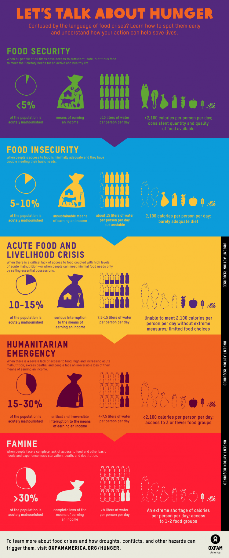
Let’s Talk About Hunger
Amnesty International
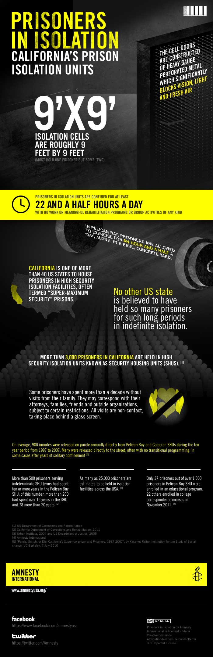
Prisoners in Isolation
6. Share it!
After all that work, your infographic should be seen! Host it on a web page or a platform with embedded social sharing tools. Include it in your newsletter and post it on your social media accounts.
What kind of data visualization does your nonprofit do? Share your knowledge, experience, and infographics in the comments!


1 Comment