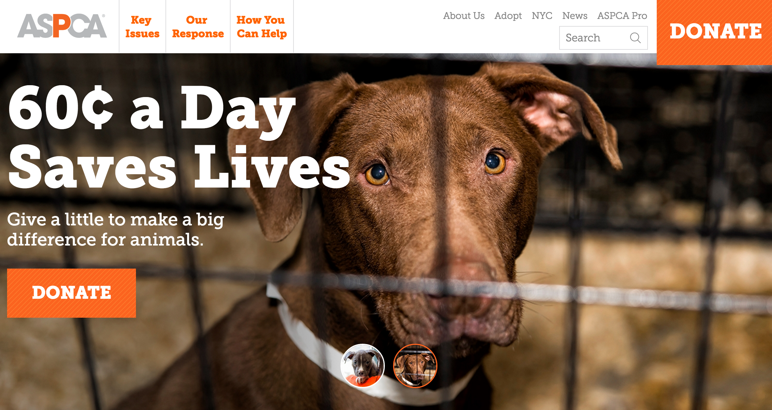
As a modern nonprofit, it’s important to know what to ask for when doing a website redesign. Since technology is changing so rapidly, it’s smart to stay one step ahead of the game so that your content remains relevant for a long time.
What is involved in a website redesign? On the surface, web design is beautification — upgrading to a clean, modern look that keeps your organization looking fresh and your content easily digestible. But even more important are the changes behind the scenes: functionality improvements like restructuring your site to be mobile responsive and ensuring every page has a call-to-action.
For those of you thinking about making improvements to your site, we have compiled a checklist of the most pertinent aspects of a modern nonprofit redesign. Read on!
1. Your website, email outreach, and other online marketing need to be mobile optimized
This is first and foremost. 43% of adults around the world own a smartphone, and this number is projected to grow continuously. 55% of email opens are also on mobile — meaning that responsive templates should be a top consideration when contacting your supporters and developing online campaigns. In addition, your site’s mobile-friendliness will affect its ranking on a Google search. It is therefore extremely important to mobile-optimize your materials so that your content works with all of the devices now available, as well as with all the new devices that will inevitably come into being.
2. Use effective imagery
On the modern web, photos and videos are more compelling than long, dense paragraphs of text that most viewers surely won’t read. Keep your wording concise and clear and illustrate your fine points with imagery to get your message across in a quick and powerful way.
3. Maximize readability
In addition to keeping your text concise, use a large, easy-to-read font size and allow for plenty of white space around your content.
4. Draw attention to your call-to-action and “Donate” buttons
These should be especially big, colorful, and easy to find, perhaps snagging a spot in your top navigation as well as in your body content. Also prominent should be your social media icons and e-newsletter sign up form, which should display, at a minimum, in your footer.

5. Think about what you want viewers to learn in the first few seconds of browsing your site
This is critical in developing a great home or landing page, which sets the stage for going deeper into your content. What is your mission? What are the best possible choice of words and imagery you can use to convey the essence and importance of your nonprofit’s work? In answering these questions, you can prioritize the information that goes front and center on your site.
6. Set a plan for maintenance
There’s nothing worse than having a beautifully redesigned site that you can’t update! In an ideal world, your nonprofit would have someone on staff that acts as your designated web person with the required skill set for maintenance. But if that’s not the case, consider moving to a simple, easy-to-use web platform that someone on your staff can learn, ensuring first, of course, that it is modern, mobile responsive and fits the needs of your organization.
7. Your website redesign can Turn your online viewers into life-long supporters
It goes without saying that you will need to get rid of those Web 1.0 Paypal buttons and links to third-party apps that refer your supporters off-site. Upgrade to a mobile-responsive and aesthetically modern fundraising platform like Flipcause that seamlessly integrates engagement tools into your site.
Pro tip: Don’t have the time to lead a redesign, but still need to upgrade your website? Flipcause offers free website modernization services with most subscription plans, where your existing content is transferred to a modern, mobile responsive site that focuses on supporter engagement. This holiday giving season is the perfect time to ensure your site is beautiful and ready to accept mobile donations. Request a demo to learn more about this free service!
Is your organization undergoing a website redesign? What best practices does your organization follow? Please share with us in the comments!


